CA TECHNOLOGIES
Components, consistancy, flexibility . . .
CA Technologies
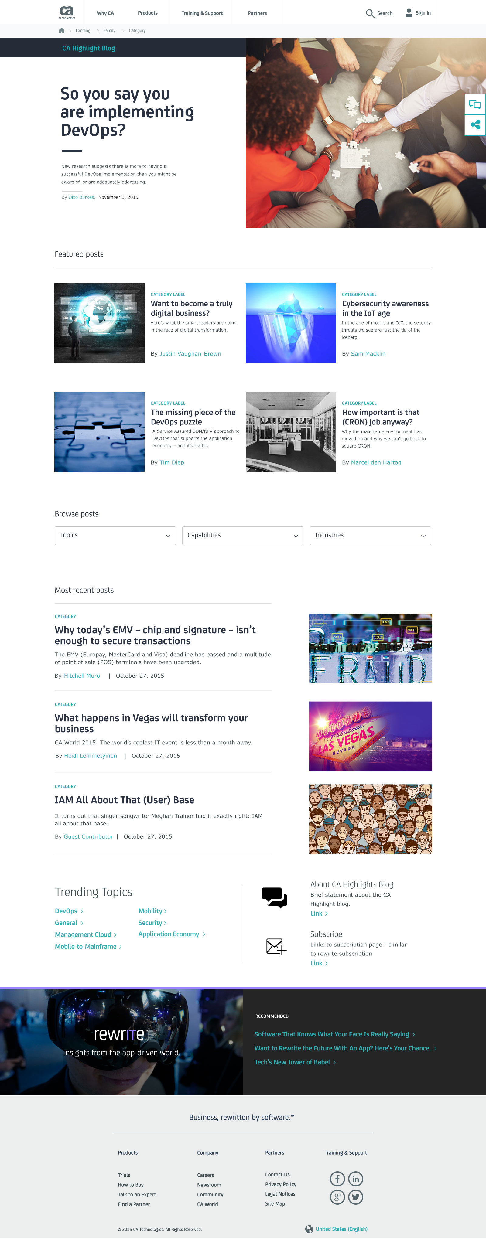
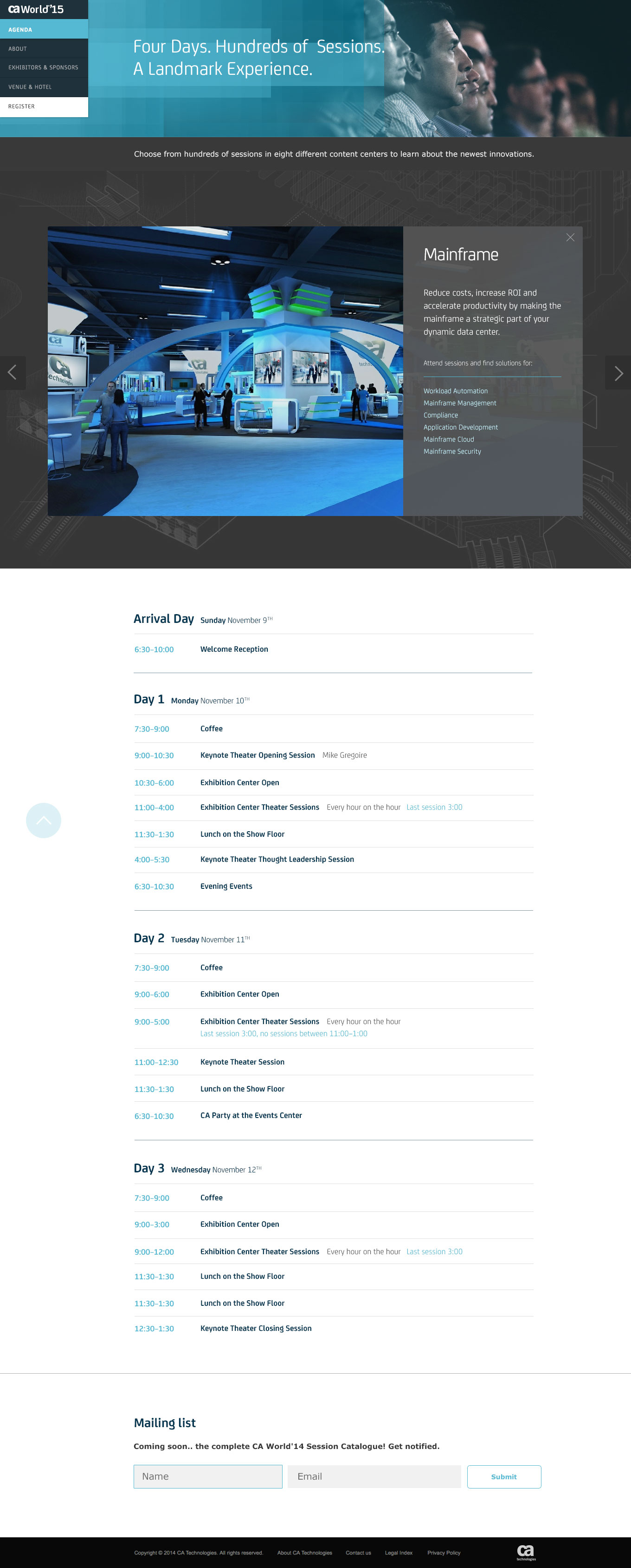
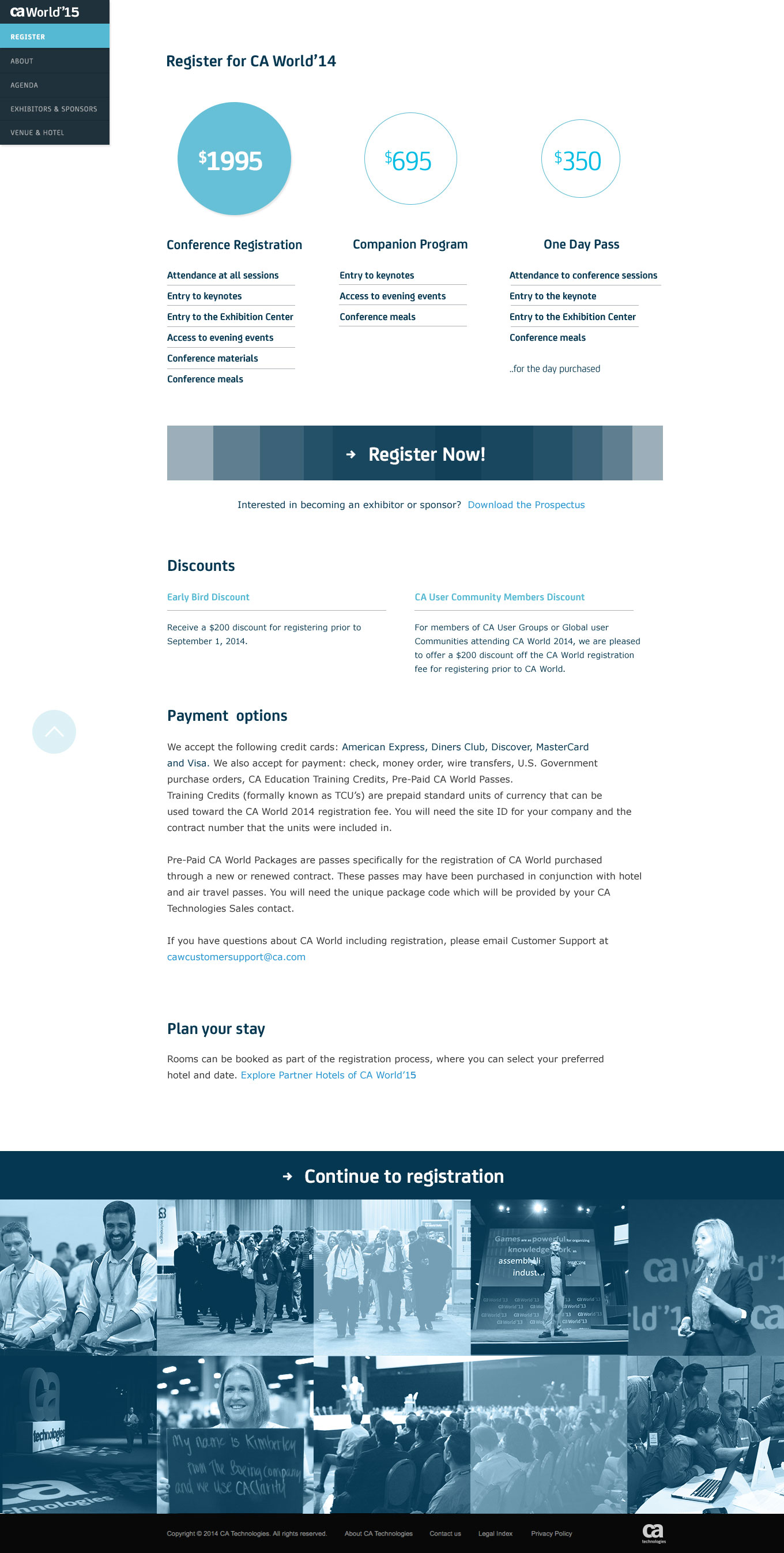
This 30-year-old software titan needed a comprehensive brand refresh to pull it out of legacy and into the mobile-first, app-inspired world of design. We sought after a comprehensive system of components and principles to help reduce design and technical debt and enable CA to design cohesive customer experiences across products and platforms.

Mobile-first, of course.

Yes, there were problems with the current site. Dead links. A bloated global navigation. An inundated, overpriced, titan of a content management system. But the biggest problem was not only the messaging or the inconsistent design language, it was the simple fact that people were getting lost when looking for products. People who were looking to buy.
The experience team took a look at each pain point, broke them down into opportunities and looked towards the best industry examples. Any migrated content within the several tens of thousand of pages on the current site met their maker in a keep, fix or kill matrix. Then, persona-based workflows were developed, a strategic narrative was put into place and wires were developed based on all of the above.
We then integrated our designs into the Adobe Experience Manager (AEM) framework that would eventually do away with the need for Photoshop comps or wireframes altogether when building new pages.

How do you make a 30-year-old technology brand show up like a breakthrough startup? The secret is in the sauce; brand principles, messaging and visual overhaul.


